

Did you know you only have between 3-5 seconds to capture your customer’s attention after they click on your website? That might be a generous timeline too!
Clearly, speed matters. Your website needs to load fast. However, website load time is a topic for another day though.
More important to us is the speed for which your customer can understand your business and how you help them overcome their problem.
In that 3-5 seconds, your customer needs to be able to answer 4 questions in their head from a glance at your website header.
- Who are you?
- What do you do?
- How does it make my life better?
- How do I buy it?
If your website header doesn’t answer those four questions within that 3-5 second timeline, your website won’t bring in the leads and sales your business needs to thrive. People will leave.
You’re probably thinking right now, “That is a LOT of information to include in a website header! How on earth will they read it and understand it in less than 5 seconds?”
Good news! You can cover all this information in fewer characters than a tweet. Let’s walk through what each of these sections includes and then take a look at a few examples from our clients.
The 4 Pieces of an Effective Website Header
If your website header is going to be effective, it’s going to have to tell a quick story. You know how much we love a good story framework. Here is a simple framework to create an effective website header.
1. Who are you?
This is the easiest question to cover on your website. It’s just your logo. As long as your logo says your brand name, you’re covered. If not, you might need to include the company name right above the headline in your header.
Make sure, either in your logo or above your headline, your brand name is clearly stated. Also, make sure your logo is crisp and clear. Nothing makes a bad first impression quite like a pixelated or blurry logo.
2. What do you do?
You want to make sure you position your brand as solving a problem for your customers or clients. Whether you state it directly or it is very clearly implied from your headline, your customer needs to know what problem you solve.
Maybe you have several products or services that solve multiple problems. What is the overarching problem your brand solves then? Is there a cohesive theme to the problems you solve as a business? Use that.
3. How does it make my life better?
Your clients want to know where you are taking them. What does success look like for them on the other side of doing business with you? Make sure to give a preview of what success looks like for them in your header.
This can be done both in words as well as images or videos in your header. The best option is both! Show them and tell them what success looks like for them after you help them overcome their problem.
4. How do I buy it?
One of the biggest mistakes brands make is failing to put a clear Call-to-Action in their header. Your customers need to understand quickly what the ONE THING they need to do to overcome their problem and achieve success is.
For you, the CTA is your cash register. You wouldn’t hide the cash register in the bathroom of your brick and mortar store, would you? Why would you hide it on your website?
Now that we’re clear on each piece of your header, let’s take a look at some examples from our clients.
3 Effective Website Headers

Chesapeake Wills and Trusts
As you can see, there aren’t very many words in the header of this website. Still, it covers all 4 sections of a website header. Let’s break it down.
- Who are you?
- Chesapeake Wills and Trusts logo and name above headline.
- What do you do?
- Protect your home and life savings
- How does it make my life better?
- You get to relax knowing everything is protected.
- How do I buy it?
- Schedule a call
How simple was that?! Typically, we would include an image or video in the header that depicts the success we want their clients to experience. In this case, the firm decided to go with the local bridge. In the end, it’s the client’s call. We suggested a picture of a grandmother playing with her daughter and grandchildren on the beach. Totally relaxed and enjoying what’s most important in life knowing she doesn’t have to worry about her home and life savings.
You will see they have three distinct practice areas; Estate Planning, Probate, and Medicaid Crisis. They all nuance the overall problem the law firm solves, but we were still able to create a clear and simple headline that serves as an umbrella over each.
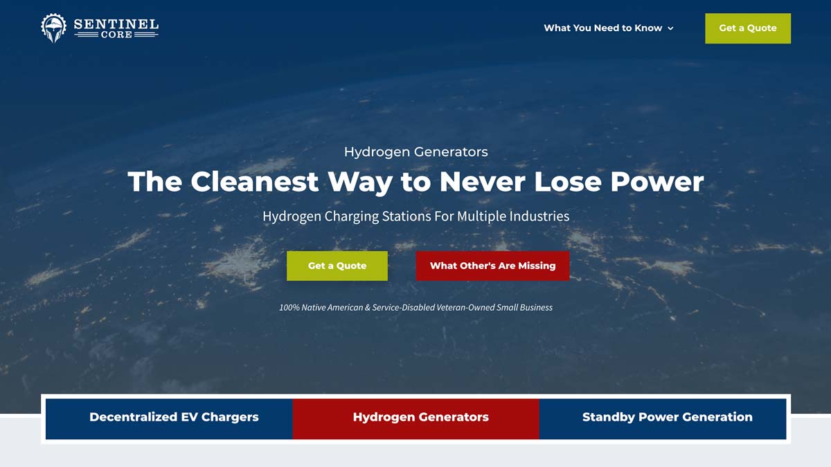
Sentinel Core, LLC
Again, very few words in this header. Less than a tweet and it still covers everything a header needs for a website.
- Who are you?
- Sentinel Core logo
- Sentinel Core logo
- What do you do?
- Hydrogen Generators
- Hydrogen Generators
- How does it make my life better?
- Never lose power and do it in an environmentally friendly way (cleanest)
- Never lose power and do it in an environmentally friendly way (cleanest)
- How do I buy it?
- Get a quote.
Easy-peasy lemon squeezy (as my daughters say).
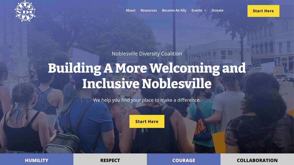
Noblesville Diversity Coalition
In this one, we again use very few words, but we also make a different use out of the value stack below the header to give the values of the organization.
- Who are you?
- Logo and headline since the logo is an acronym.
- Logo and headline since the logo is an acronym.
- What do you do?
- Build a more welcoming and inclusive Noblesville (Indiana)
- Build a more welcoming and inclusive Noblesville (Indiana)
- How does it make my life better?
- You find your place to make a difference
- You find your place to make a difference
- How do I buy it?
- Start Here
Simple and Clear is Key
However you stack your website header, the key is to be as simple and clear with your words and layout as possible. You need your customers or clients to be able to understand all 4 questions in less than 5 seconds.
You will be tempted to use a clever or cute tagline in your header. Absolutely DO NOT do this if it is not also 100% clear. Cute and clever can kill your business. Always err on the side of clarity of message over cleverness.
What questions do you have? Can we help you fix your header and build out a new website that more effectively grows your business? Let’s do it!
One more thing…
Keep your navigation menu as simple as possible. Ideally, 3 top-level navigation items and a call-to-action button. Don’t overwhelm your visitor right from the start. Make sure their eyes draw to the headline and the main CTA. Nothing in your navigation matters until your customer understands the 4 items we’ve discussed for your header.


0 Comments